Coca-Cola’s gift for creating universally adored advertisements isn’t a secret, but it’s in their recipe for success. Of all their iconic songs and symbols, the Coca-Cola Polar Bears are one of my favorites. The adorable bears made their first appearance in France almost 100 years ago and have represented Coke on their winter-themed cans ever since.
It’s no surprise our favorite cola company used them in a unique and entertaining way. Coca-Cola’s Polar Bear illusion ad campaign is so fun each winter no matter how many times you’ve seen it… But did you ever really see it??? Look again and look closely… Can you figure out what the illusion really is?
The Man Behind The Can
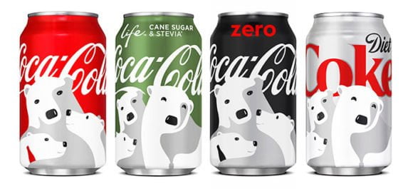
The genius behind this twist to the campaign is Noma Bar, an Israeli graphic designer, and artist. Using a minimalist approach, Noma uses negative space to create art that speaks volumes. He utilized this technique in the winter-themed campaign of Coca Cola cans sporting the famous polar bears. Talking about his work to Design Taxi, Bar claims, “The illustrations feel fresh and playful and capture special holiday moments of family togetherness.”
Take A Guess – What Illusion Are We Talking About?
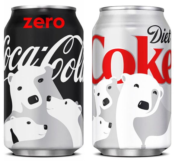
Here’s A Closer Look To Give You A Better Picture (Hint-Hint: look at the II’s)
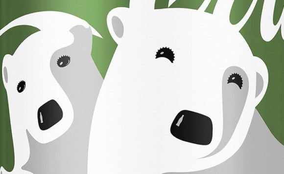
The polar bears’ eyes are made of Coca-Cola bottle caps!
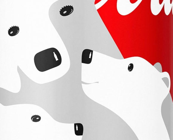
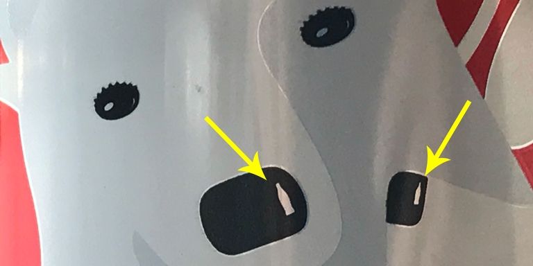
Now you just need a really great eye for detail to figure this out. Look closely at the shine on the bear’s nose. It’s the Coca-Cola bottle itself!
Bottle-Cap Eyes Once Again!
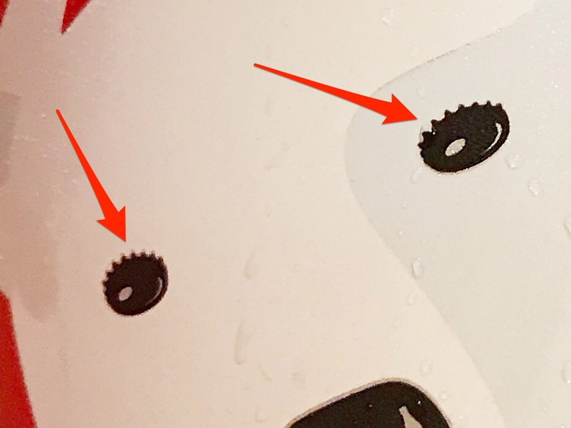
Bar’s talent in using negative space is on full display here. The illusion created here is of a Coke bottle being opened and the art spilling out of it!!
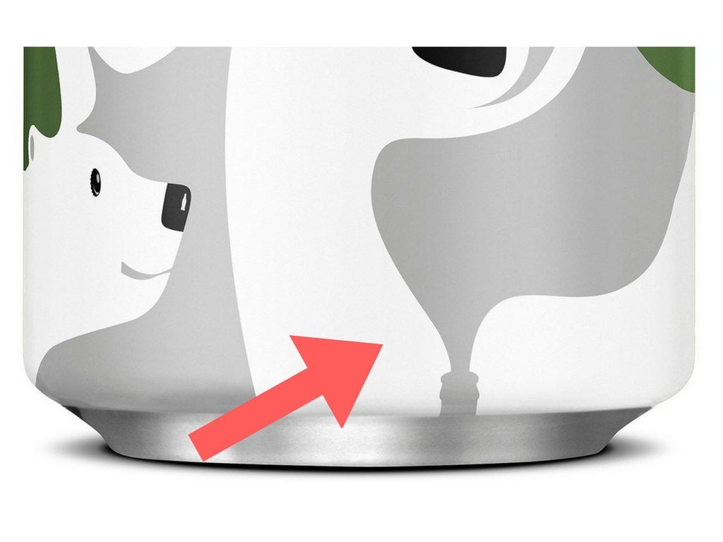
Does this tempt you to go grab one of the Coke cans? Share with friends and family to give them a drop of refreshment.
Leave a reply


